
Classic Album covers: Disintegration – The Cure
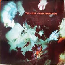
When The Cure released Disintegration in 1989, it marked a return to dark romanticism – a plunge back into the lush, melancholic sound that defined their early-80s masterpieces. And from the moment listeners saw the album cover, it was clear that this was not a pop record. The sleeve itself feels like a dream you aren’t entirely sure you want to wake from: blurred, floral, ghostly, and unmistakably Robert Smith
But behind that spectral image lies a surprisingly intimate story
A vision rooted in Robert Smith’s imagination
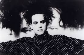
The artwork for Disintegration was created by Porl Thompson (Pearl), the band’s guitarist and visual artist. Thompson worked closely with Robert Smith, who had a very specific atmospheric feeling in mind: something that looked fragile, dissolving, and emotionally submerged. Smith envisioned an image that suggested memory, decay, and underwater drift – a visual equivalent to the album’s sound
Rather than hiring a photographer or designer, The Cure kept it in the family. Thompson collected elements from photographs of flowers, paint textures, and close-ups of Smith’s face, then manipulated them using analogue layering techniques. The aim was deliberately low-tech: smudge, distort, overlay, and obscure until the image felt like a half-remembered dream
Why it looks so blurred and ghostly
The smeared, melting quality of the cover is not the product of digital editing (this was 1989, after all), but a mixture of:
- manually blurred photographs
- paint washed over acetate
- multiple exposures
- soft-focus portraiture
- tinting and re-photographing layers until they lose sharpness
Thompson once remarked that he wanted the image to look ‘dissolved,’ as though the viewer were looking at it through tears, mist, or memory. Robert Smith approved instantly – it perfectly mirrored the emotional tone of songs like Plainsong, Pictures of You, and The Same Deep Water as You
The album is about
falling apart gracefully, and the cover is exactly that: beauty in the process of fading
The flowers: more than decoration
The flowers drifting across the cover aren’t merely a gothic flourish. They were chosen to echo two themes:
Decay and transience – flowers preserved just long enough before they wilt.
Romanticism with a bruised edge – sentimental, but not sweet; fragile, but not delicate.
The Cure were often misunderstood as ‘gloomy,’ but Disintegration is full of emotional warmth – heartbreak, nostalgia, longing. The flowers capture that tension: romantic imagery on the verge of collapse
The hidden faces
Many fans don’t realise that the cover includes multiple ghosted faces, not just Smith’s. Some are barely visible, submerged beneath layers of paint and shadow. Thompson added these to create the impression of emotional echo – a sense of crowded interiority, like memories overlapping
Robert Smith later said that the cover reminded him of
“a blurred version of myself drifting through someone else’s daydream”
This line perfectly captures the strange intimacy of the image: you’re looking at Smith, but he’s disappearing even as you try to focus on him
Aesthetic as atmosphere: why the cover matters
Disintegration is often called The Cure’s masterpiece, and not just because of the music. The entire album – sound, lyrics, visuals – was conceived as a unified mood. Smith was turning 30, spiralling into self-doubt, and convinced that adulthood meant the end of passionate creativity. That anxiety shaped the album’s emotional weight
The cover art isn’t merely decoration – it’s the door into the world of the album
It sets the tone:
- soft edges instead of sharp
- intimacy instead of clarity
- emotion over realism
- atmosphere over narrative
Even before the first note of Plainsong,‘ the image prepares you for immersion: you are about to enter a world where everything drifts, swirls, and dissolves
Legacy: One of the Great Art-Album Marriages
More than three decades later, the cover remains one of the most instantly recognisable in alternative music. It helped cement:
- Robert Smith’s status as a goth-romantic icon
- The Cure’s identity as a band who treat visuals and atmosphere with the same seriousness as songwriting
- The idea that album art can function as emotional architecture
It’s frequently cited in lists of the greatest album covers of the 1980s, and its influence can be seen across dream pop, shoegaze, darkwave, and contemporary goth aesthetics
What makes the Disintegration cover so enduring is that it refuses to be literal. It’s not a band photo, not a logo, not a statement. It’s a feeling – a fragile blur of face and flower, drifting like the record’s most famous lyrics


Leave a reply
You must be logged in to post a comment.