
Classic Album covers: I-Feel-Like-I’m-Fixing-to-Die – Country Joe and the Fish
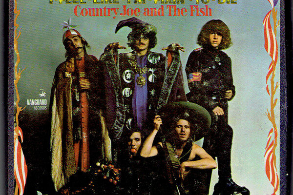
When Country Joe and the Fish released I-Feel-Like-I’m-Fixin’-to-Die in 1967, the Vietnam War was raging, and protest songs were everywhere. Yet few records attacked the war as bluntly — or as cheekily — as this one. Its title track, with its sarcastic chorus “And it’s one, two, three, what are we fighting for?”, became a countercultural anthem. And its cover art — garish, cartoonish, and chaotic — carried the message straight off the record shops’ shelves
A comic book of war
Designed by Jules Halfant and Mel Tanner, the sleeve looks like psychedelic pop art on a sugar rush. The band pose in mock military uniforms, surrounded by explosions, planes, and lurid type. It’s bright, messy, and deliberately amateurish — more underground newspaper than slick studio design
That was the point. Like the satirical handbills plastered across San Francisco at the time, the cover mocked the seriousness of military imagery by turning it into absurd theatre. War, it suggested, wasn’t noble or heroic. It was ridiculous
Protest in packaging
The design broke with the visual rules of the late ’60s. Folk records leaned on earnest portraits, psychedelic peers preferred dreamy abstraction, and Motown covers projected polish. Country Joe’s looked like a protest poster — because that’s what it was
This made the sleeve as much a political statement as the music inside. By ridiculing the iconography of war, the album stripped it of authority and turned itself into a portable piece of protest art
Proto-punk Spirit
Though born in psychedelia, the sleeve feels oddly punk. It’s brash, irreverent, and unashamedly messy. That raw visual attitude — part satire, part sabotage — would resurface a decade later in punk and anarcho-punk design
Where Country Joe used humour, punk bands pushed the style toward confrontation. The shared instinct was the same: use the album cover not as decoration, but as a weapon
From satire to shock
The evolution from I-Feel-Like-I’m-Fixin’-to-Die to Crass, Dead Kennedys, and The Clash shows a shift in tone that mirrors cultural change. In 1967, humour and satire felt like powerful tools for undermining authority. By the early 1980s, after Vietnam, after Watergate, after Thatcher and Reagan, the mood had darkened. Punk sleeves didn’t mock war — they shoved its brutality directly in your face
Yet the DNA of Country Joe’s album cover runs through them all: the rejection of polish, the embrace of collage, the willingness to make a sleeve into a political statement rather than mere packaging
-
Crass – Christ – The Album (1982): A dense collage of war images, logos, and leaders, designed by Gee Vaucher. Like Fixin’-to-Die, it hijacked propaganda and turned it back on itself
-
Dead Kennedys – Plastic Surgery Disasters (1982): A stark photograph of a malnourished child’s hand in an adult’s palm. No humour here — just horror
-
The Clash – Combat Rock (1982): A photograph of the band in Southeast Asia, its ironic title echoing Country Joe’s trick of making war look absurd
The tonal shift is striking. In 1967, satire and psychedelia could still puncture authority. By the early 1980s, punk artists opted for blunt confrontation — stark collage, brutal photography, and irony edged with rage
A lasting legacy
Seen today, I-Feel-Like-I’m-Fixin’-to-Die is more than a psychedelic relic. It pioneered a way of thinking about album art: as protest, as parody, as political cartoon
At Woodstock in 1969, when Country Joe led half a million people in the “Fixin’-to-Die Rag,” the cover’s imagery of soldiers-as-clowns seemed prophetic. By the time punk took hold, its satirical spirit had hardened into something harsher, but the DNA was the same
Nearly sixty years on, the cover remains one of the defining images of the anti-Vietnam movement — messy, loud, and impossible to ignore. It showed that even a record sleeve could be a protest sign. Country Joe laughed at war; punk spat at it. Both understood that music’s message doesn’t stop at the needle — it starts on the cover


Leave a reply
You must be logged in to post a comment.